The Front Door Test: When Invisible UI Still Makes Clients Work Too Hard
The client app, the portal, the reminder, the forms path. If any of those feel clever to the practice and heavy to the person walking in, the front door is already taxing care. The Front Door Test is four questions about invisible UI that still asks too much.

Most practices think about the front door as a place.
A lobby. A doorbell. A clipboard. Sometimes a waiting-room tablet.
On the phone, the front door is quieter and easier to miss. It is the invite text. The first login. The session reminder. The form that arrives at 9:47 p.m. The message thread that feels private until it does not. The photo upload that was supposed to be simple.
None of that is decoration. It is how care starts before the hour.
This Issue of The Unburdening names a Front Door Test for independent and small-group practices: can a client find the next right step without becoming unpaid staff for your stack?
Invisible is not the same as easy
"Invisible tech" is a brand promise we take seriously at EMILE-E. Invisible should mean the technology stops demanding attention so the human relationship can keep it.
It does not mean the client does the integration work for free.
A portal with six logins is not invisible. A reminder that dumps someone into a PDF maze is not invisible. A beautiful clinician dashboard that leaves the client side as an afterthought is not invisible. It is just asymmetric.
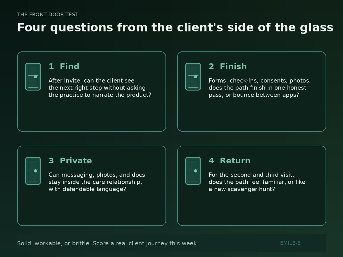
The Front Door Test
Score each job for a real client journey this week (a new intake, a returning session, a form, a message, a payment). Solid, workable, or brittle.
- Find the next step. After invite, can the client see what to do next without asking the practice to narrate the product?
- Complete the ask once. Forms, check-ins, consents, photos: does the path finish in one honest pass, or bounce between apps and "please try again"?
- Stay private without theater. Can the client trust that messaging, photos, and documents stay inside the care relationship, using defendable language the practice can stand behind (no overclaims)?
- Return without relearning. For the second and third visit, does the path feel familiar, or does every touchpoint feel like a new scavenger hunt?
If any one of those four is brittle, the front door is already taxing clinical trust. Clients rarely complain in product language. They go quiet, delay forms, miss the join link, or decide the practice feels hard
Presence still sits beside the door
The Presence Test has not changed. Does this reduce cognitive load at the moment of care, or add another field, tab, or portal? Who does this serve when clinical time and admin time conflict?
The Front Door Test asks the same question from the client's side of the glass. Presence protects the hour. Front door protects the approach to the hour. Platform and Claims still matter. A perfect remittance path cannot rescue a client who never finished intake because the app felt like work.
What good looks like (without theater)
You do not need a consumer-app design studio. You need a path a tired person can finish on a phone between school pickup and dinner.
Next step is obvious: one primary action after invite, not a menu of mysteries.
Ask finishes once: forms and check-ins do not require a second writing job in email.
Privacy is plain: copy stays defendable (secure messaging, private to you and your care team, protected in your practice). No slogans the product cannot keep.
Return is familiar: the second visit is shorter to start, not longer.
Wherever the answer is "we explain it on the phone every time," that is the design problem. Not a branding problem.
What to audit this week
Pick five real client journeys (new or returning). For each, score Find / Finish / Private / Return.
Strengthen the brittle ones first. Tool shopping second. If the client app is the product surface, treat it like the lobby paint: visible, calm, and not asking people to earn entry.
Coordination is the product
EMILE-E builds for the practice side of this reality. Practice OS is meant to keep operational truth coherent so scheduling, notes, claims, and the client front door stop living as separate improvisations. VibedIn and Sesh sit in that same family when the practice chooses the soft packages that fit.
Practice OS is $89 per clinician per month. VibedIn is $49 per practice per month. Sesh is $10 per clinician per month.
No invented urgency. No fake drop-off charts. Just the thesis: if clients already work to reach you, make the path intentional.
Closing
Clients did not ask to become your integration layer.
Find the next step. Finish the ask once. Keep privacy plain. Make return familiar.
Score the four. Strengthen the brittle ones. Protect the approach to the room.
That is how invisible tech earns the word invisible.
The Unburdening is EMILE-E's practice-side letter on building mental health infrastructure that holds. Quiet coordination over tool sprawl.